Finding actually matching presentations at your next conference with text-mining
Attending my first two major conferences as a PhD student over the past two years at the European Geoscience Union (EGU) in Vienna, I experienced a familiar struggle shared by many: feeling a bit lost among numerous presentations and trying to pinpoint what truly interests me. Like many others, my daily challenge at EGU involved typing in keywords for topics I care about, fingers crossed that I don’t miss out on anything important (FOMO).
Yet, at last year’s EGU an idea emerged from discussing with colleagues, how one of the key parts of my PhD could ease this experience: text-mining. In my research I use various tools from the field of text-mining and natural language processing to process large amounts of texts. Respective algorithms allow for various features: classification of text, predicting the next word, clustering similar texts. The idea: why not use text-mining on EGU abstracts to find those similar to a particular topic or your very own abstract. By transforming each abstract into a high-dimensional vector (embedding) that reflects its context and content, we could develop a landscape of abstracts presented at EGU. On the landscape, you could identify your own position and abstracts in close neighborhood.
This technique itself is not new. In fact, various research papers use this technique to structure papers on a particular topic. For instance, Callaghan et al. (2020) use this technique to map out research papers on climate change, allowing them to compare existing research to what’s represented in the IPCC reports. To cut it short on many other research papers: natural language processing is very good in clustering together similar abstracts, providing comprehensive overviews of thousands of documents.
The idea and plans for #EGU24
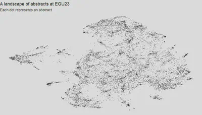
Inspired by a nascent idea following last year’s EGU, I delved into the realm of past abstracts. Collecting a dataset comprising approximately 15 thousand digitally available abstracts from that year’s EGU, I transformed these abstracts into high-dimensional (500 dim) numerical vectors that encapsulate their content using SBERT, a cutting-edge technique for this task. To transform these embeddings into a visually comprehensible format, we used dimensionality reduction to provide these in a 2-dimensional space. Here, the UMAP dimensionality reduction method played a pivotal role, condensing these 500 dimensions into 2. The resulting map, presented below, offers a visual representation where each dot signifies an abstract. Proximity on the map denotes similarity in content, unveiling distinct patterns such as the prevalence of specific topics, for instance, research on drought impacts.
Now, envision yourself at this April’s EGU, curious about how these tools can enhance your experience. Perhaps you’re keen on connecting with colleagues engaged in research akin to yours or discovering novel insights within another field. Navigating the map, you locate your own abstract and start exploring. Which abstracts stand as your neighbors, sharing similar content? For a more refined search, you might want to identify abstracts with embeddings most akin to yours. As you peruse the landscape, noting everything of interest, you compile a comprehensive list, including abstract details, presentation locations, and times. In doing so, you effortlessly assemble a curated selection of presentations aligning with your research interests.
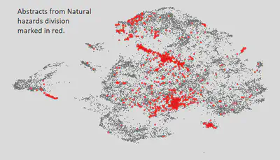
Why is this method potentially better than just focusing on what’s in your division? Let’s look at the abstracts in the natural hazards division. In the picture below, all the abstracts are shown, and the ones from the natural hazards division are marked in red. See how spread out they are? It shows that this division covers a lot of different topics, which is good. But, it also means you might miss some talks that are important to you if you only stick to one division.
So here’s what we’ve got planned for this year’s EGU: Collaborating with colleagues at UFZ, we’re currently in the process of crafting a tool designed to seamlessly execute the concept I just outlined, tailored for pinpointing relevant presentations at EGU24. The tool will display an interactive visualization of the landscape of abstracts, enabling you to effortlessly locate your own or any abstract while identifying those with similarities.
Once you’ve identified an abstract of interest, this tool will offer information on the presentation’s location, scheduled time, and the authors involved. Stay tuned for further updates.
References
Callaghan, Max W., Jan C. Minx, and Piers M. Forster. “A topography of climate change research.” Nature Climate Change 10.2 (2020): 118-123.